Brand book / v2 Elemental
Brand book
LAYR makes sneakers that age like rock. The identity follows one idea: layers, stacked over time, left in plain view.
01
Logo
Symbol
Logotype
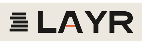
The symbol is a cut through the sole: five strata of slightly different widths, offset like sediment. It holds at 16 px as a favicon and at 4 cm as a heel stamp.
The logotype is an extended grotesk on a 9-unit stem. The A has no crossbar: a single thin stratum floats in its place.
02
Colour
Core
Paper
#F5F4EF
Page ground.
Ink
#0F0F0E
Type, buttons, icons.
Core
#151515
Dark tiles and footer.
Stage
#D6D6D9
Studio sweep behind every pair.
Elements
Earth
#F4CF6F
Water
#9FD5F7
Fire
#EF5D44
Air
#F9F6F1
Element colours are used on full tiles, never as text colour. Photography carries the rest.
03
Type
Display / Archivo 900, uppercase, tracking -0.06em
Four elements. One sole.
Text / Inter 400 and 600
Calm, precise, short sentences. We say what the shoe does and stop there. No superlatives, no hype.
Labels / IBM Plex Mono, uppercase
Layer 03 / Clay / 4 mm
04
Glyphs and motifs
Element glyphs after the classical alchemical symbols. Fire and Air point up, Water and Earth point down. Air and Earth carry a bar.
Contour lines, for texture and separators
Rounded tiles (22 px), pill buttons, round arrow buttons and a light film grain on solid colour tiles.
05
Voice
We say
“Made to last, not to be replaced.”
We never say
“A revolutionary game-changer.”